A typical Dreamflows river flow graph:
You may arrive at a River Flow Graph page from Dreamflows in a number of ways:
- Via a flow graph link on the Flow Graphs Index page.
- Via the blue ("place name") link associated with a flow site on a flow report page.
- By clicking on the
 image associated with a flow site on a
cross-listing page.
image associated with a flow site on a
cross-listing page. - By clicking on the image associated with a flow site on an
alphabetical listing page.
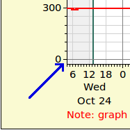 At the bottom of the graph, there's a small vertical gap, as indicated by the blue arrow in the snapshot on the right.
This gap ensures that zero cfs (or zero gauge height) values displayed on the graph don't crowd into the lower hash marks and get lost.
At the bottom of the graph, there's a small vertical gap, as indicated by the blue arrow in the snapshot on the right.
This gap ensures that zero cfs (or zero gauge height) values displayed on the graph don't crowd into the lower hash marks and get lost.
The following section describes the title and various links appearing on the graph pages, while each of the remaining sections describes one type of river graph page.
All the images on this help page, except the Agency Flow Graph, have been reduced in size from their originals.
The following applies (in this case the graph itself is blanked out to make it clearer what is being discussed):
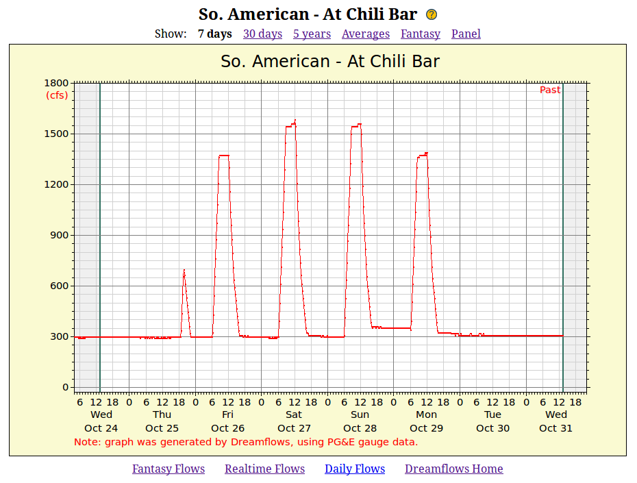
The first line gives the Dreamflows flow site name (So. American - At Chili Bar in this case).
Clicking the
 icon just to the right of flow site brings you to this help page.
The bold black entry on the Show: line tells you which graph is being displayed. In this case it's displaying 7 days of data. The rest of the line offers you links to other graphs for this flow site. The possible links are as follows:
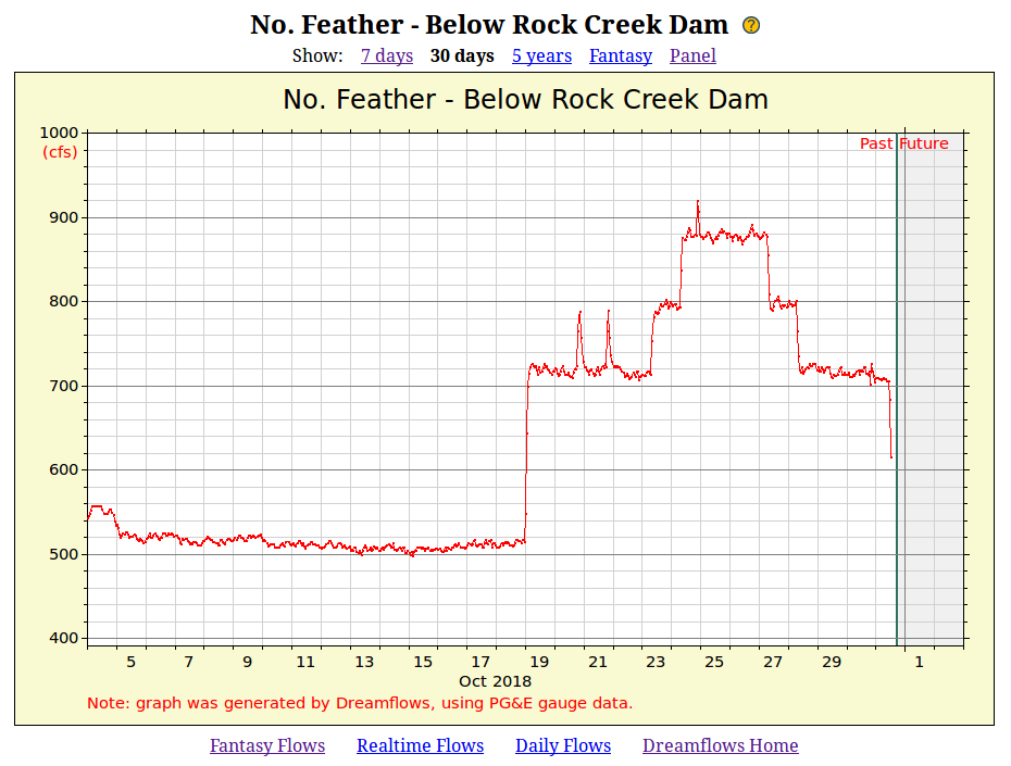
- The Day graph. The link name gives the number of days of historical data that will be displayed; usually 7 days (as shown above).
- The Month graph. The link name gives the number of days of historical data that will be displayed; it's always 30 days.
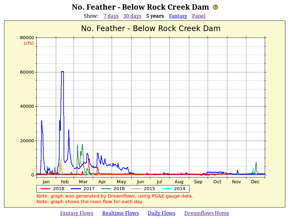
- The Year graph. The link name gives the number of years of historical data that will be displayed; it's typically 5 years.
- The Averages graph. This plots weighted average, weighted median and minimum flow for this flow site, all on the same graph.
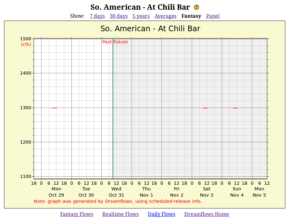
- The Fantasy graph. This graph shows recent actual flows, plus several days of projected (future) flows.
- The Panel, which shows Day, Month, Year, Averages and Fantasy graphs for this site.
At the bottom of the page, the following links are possible:
- Fantasy Flows (if present) links to the most appropriate fantasy flows report entry for this site.
- Realtime Flows (if present) links to the most appropriate realtime flows report entry for this site.
- Daily Flows links to the most appropriate daily flows report entry for this site.
- Dreamflows Home links to the Dreamflows home page.
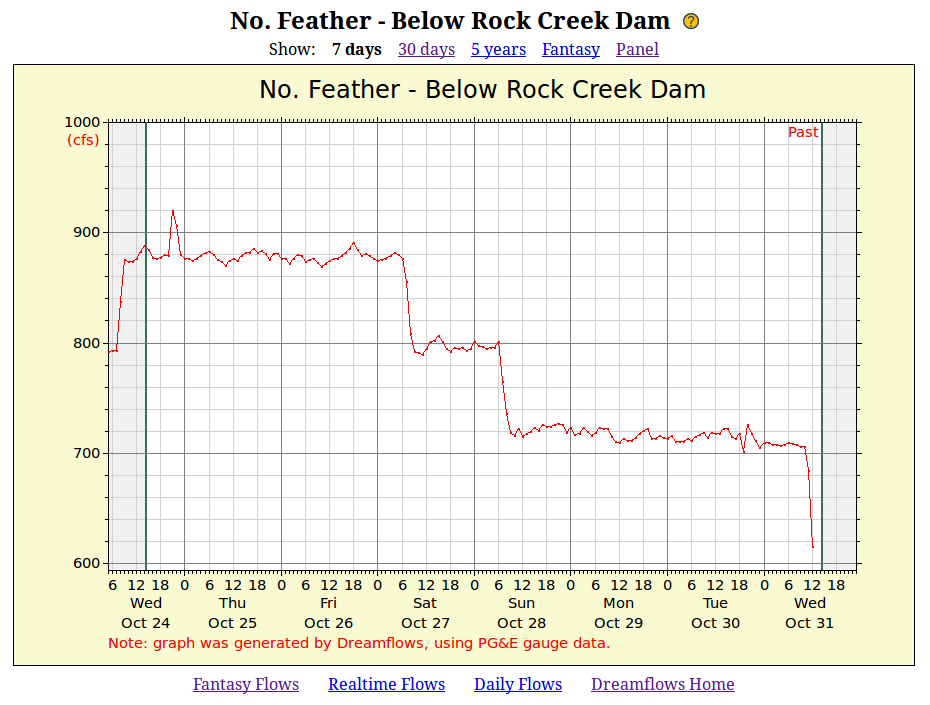
Typical Flow Graph:
The right-side vertical line (just to the right of Past) shows the time at which the graph was drawn.
The left-side vertical line is one week earlier.
Most gauges record flow information every 15 minutes, but transmit data in a group only every hour.
The result is there's often a gap between the end of the flow plot and the right-side vertical line as shown here
(since the very latest information isn't available yet).
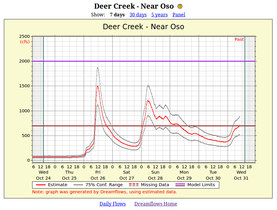
Estimated Flow Graph:
If the legend at the bottom of the image says using estimated data but no gray lines are shown, then confidence is unknown.
That doesn't necessarily mean the estimate is bad, just that Dreamflows doesn't know what confidence value to assign.
Whether a confidence range is given or not, be aware that the reported flow is just an estimate
and may well be incorrect.
In this example, the red and gray plots are continuous (i.e. solid lines).
The Missing Data legend, next to the dashed red and gray lines,
says that short sections of missing data will be shown with dashes instead of a solid line.
(Long sections of missing data will show up as blank areas).
The brown and purple Model Limit lines show the low and high flow limits of the model that created this estimate.
This means that the estimating model covers only the range of flows between the two lines,
and flows below the brown line or above the purple line are particularly suspect.
On the sample graph above, the lower limit is 700 cfs, while the upper limit is 2,000 cfs.
Note that these Low and High limit values are different than the Low (yellow),
Good (green) and High (red) colors used on the flow reports (which indicate typical paddler flow preferences).
Model Limit lines are shown only if they can reasonably fit on the graph.
If only the lower model limit line is shown, then the legend is Lo Model Limit
(or Hi Model Limit if only the higher model limit line is shown).
Sometimes neither limit line is shown.
Whatever the case, imagine a missing limit line is still there, but is beyond the edge of the visible graph.
Sometimes the graph shows estimated flows into the future, although this particular one does not.
Computation of future flows is possible when the physical gauge which the estimate is based on is upstream of the estimated flow site
(since current flows at the physical gauge can be used to predict future flows at the estimated flow site).
Symbolic Flow Graph:
Since the above graph flip-flops between Good and Low a lot, but is currently mostly Good,
it's reasonable to conclude that the flow is at the lower end of what Dreamflows thinks is Good.
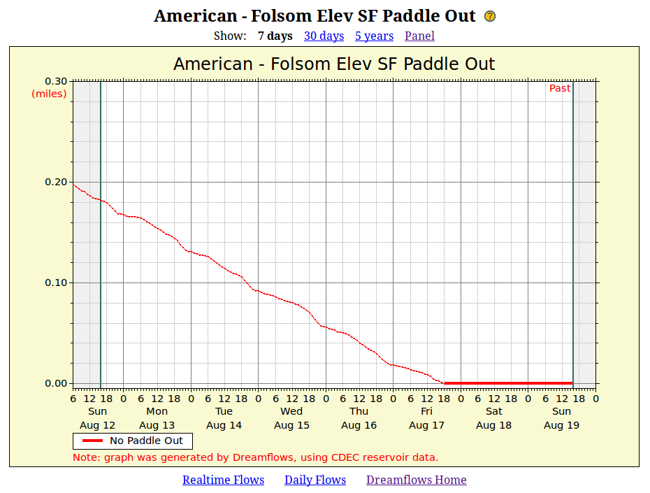
Paddle Out Graph:
The computed start-of-paddle-out point is where the river meets the reservoir.
Since the current won't stop immediately, expect the effective paddle out to be somewhat less than specified.
When the reservoir level drops below the normal take-out point (i.e. there's no paddle out),
the data line on the graph is drawn extra thick to make this fact clear.
For example, the following shows the paddle out dropping resolutely to zero, then staying there:
Agency Flow Graph:
How much data is displayed depends on the agency.
For example, USGS plots seven days of data, while the Colorado DWR plots ten days.
The following applies:
The following applies:
The following applies:
The light blue plot is the weighted median, which in this context means that for each day of the year being calculated,
the displayed value is the median for that day,
mixed in with median values from adjacent days to smooth the results somewhat.
The dark blue plot shows the minimum value of the available data for that day.
When you see a generally low flow trend that has sudden higher spikes (see below),
it's reasonable to assume the low flow trend is the accurate one.
In each of the above plots,
computations for a given day of the year are usually performed on all the available average / median flow values for that day.
In that case, the average plot for Aug 1 (say) is the weighted average of all Aug 1 average values,
and the corresponding note will say "Note: results are computed from the average/median flows for that day."
However, if the flow site is below a dam and the dam releases water on a daily cycle
(i.e. the flow changes dramatically during the day),
then the computations are usually performed on the instantaneous flow at some specific time during the day.
The time chosen matches the reported time for this flow site on the daily report (usually noon).
In that case, the average plot for Aug 1 (say) is the weighted average of all Aug 1 noontime values,
and the corresponding note will now say "Note: results are computed from the noon flows for that day."
The above three plots are all computed over the specified range of years (1998 to 2018 in this example).
Since only a limited amount of data is available (21 years here), all three graphs can be quite spiky.
This is particularly true when some data is missing for a year which otherwise contributes significantly to the graph
(since the missing data doesn't contribute the way it would if it were present).
The Y-axis in this example is river flow in cubic feet per second, as indicated by the red (cfs) legend.
Other graphs may plot gauge height in feet, which is indicated by a red (feet) legend instead.
While these graphs probably aren't accurate in detail, they should show clear general trends.
The name of this graph type is Fantasy to signify that this is projected (future) flow, not actual flow.
However, the quality of the data depends on what data is being displayed; it's not necessarily all fantasy.
The following are the main fantasy graph types:
Scheduled-Release Data:
Outside the rainy/snowmelt season,
the operating agency/utility typically releases a bit more than scheduled to make sure they meet their commitment.
On the other hand, rain or snowmelt may cause the actual flow to far exceed what the agency/utility scheduled.
Thus, in summer, actual flows will often exceed scheduled releases by 50 or 100 cfs,
and in winter/spring by hundreds or thousands of cfs.
Note that the above plot shows a scheduled release of 1300 cfs between 9am and noon on October 29, and again on November 3 and 4.
It says nothing about expected releases (if any) outside of those times, or on other days.
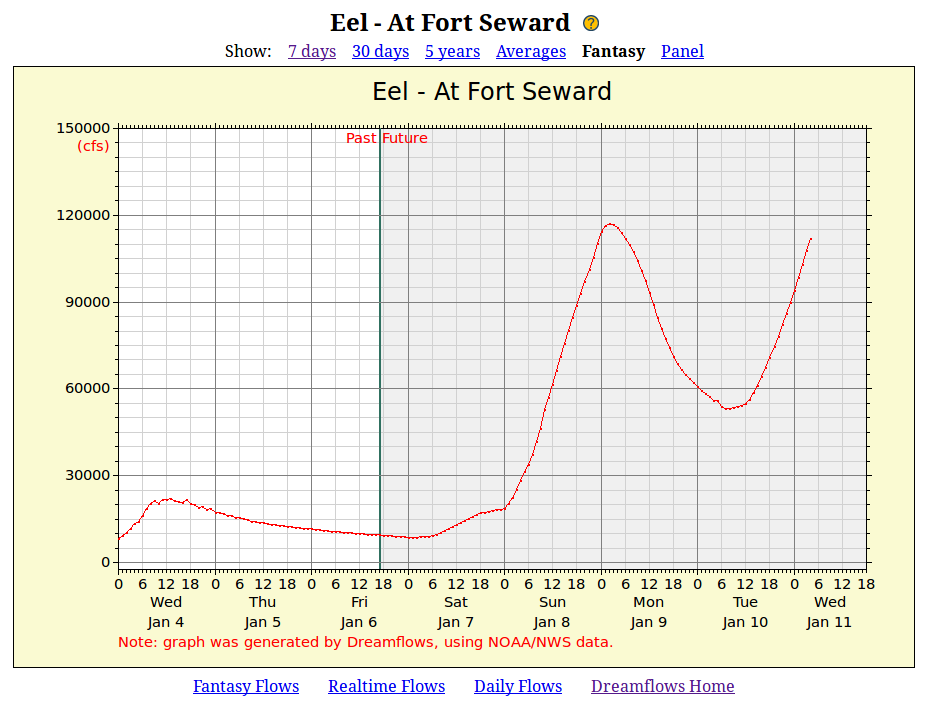
NOAA/NWS Data:
The vertical line between Past and Future shows the time at which the graph was drawn.
The data to the left of the line (i.e. Past data) is actual gauge data,
while data to the right (i.e. Future) is a prediction of future flows using NOAA's estimating model.
The flow prediction model sometimes gets it surprisingly right, and sometimes gets it completely wrong.
Even a day out, NOAA flow predictions are often inaccurate in both magnitude and timing.
Predictions five days out are often pure fiction, which is to say that the actual flows on the day bear no clear
relationship to the flows that NOAA predicted for that day five days beforehand.
The above graph shows that Friday's prediction called for a peak flow of 117,000 cfs at 2am on the 9th.
However, the actual peak was 151,000 cfs at just after midnight.
As these things go, that was a good prediction: the timing was excellent, and the magnitude was off by only 29%.
But without the benefit of hindsight, a reasonable way to interpret the above plot might be:
"Flows are expected to rise very high on the 8th, drop by about half during the next day,
then rise again on the 10th.
Always assuming the expected weather materializes; let's check back tomorrow and the next day."
I wouldn't read much more into it than that.
Nevertheless, NOAA's predictions usually give a good overall idea of what conditions are expected,
and if you're flexible can alert you to wonderful upcoming boating opportunities.
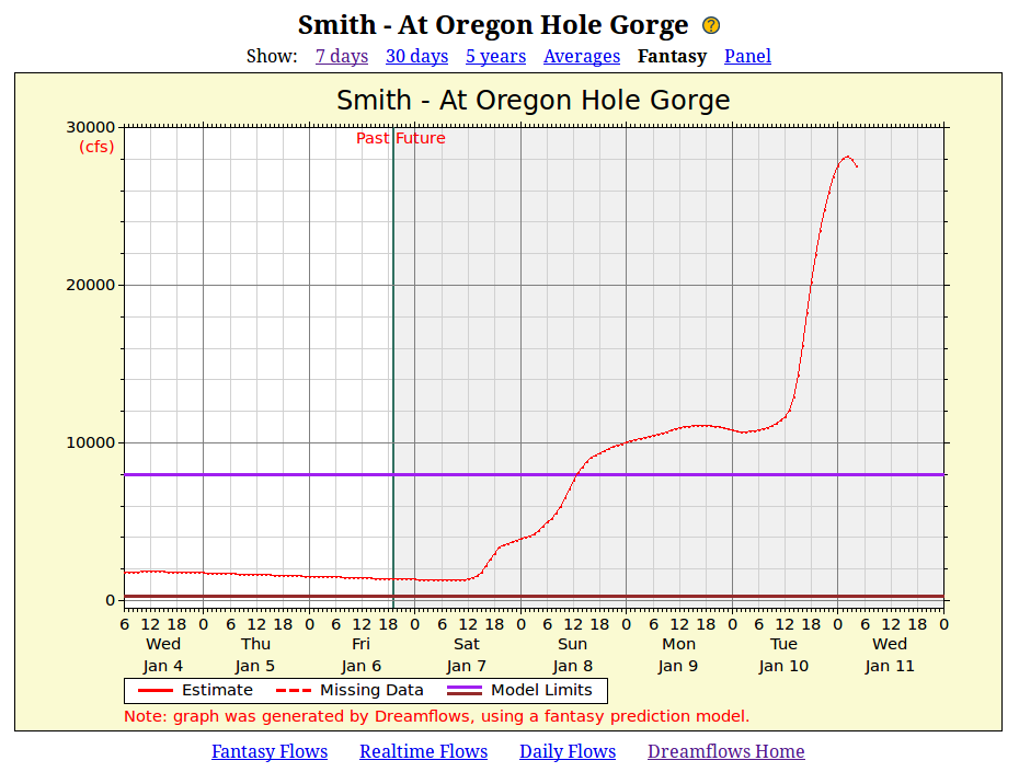
Fantasy Prediction Model:
To belabor the point, the estimate for this flow site:
Nevertheless, the plot should give a general idea of what to expect (for the above graph: flows rising, to alarming levels, over the next few days).
The above graph is straightforward: the X-axis plots date/time, while the Y-axis plots flow.
The Y-axis in this example plots river flow in cubic feet per second, as indicated by the red (cfs) legend.
It shows that the flow at noon on Oct 30 was 718 cfs.
Graphs for other flow sites may plot:
Graphs of estimated flow sites are more complex:
The red plot is the estimated flow, while the two gray plots show (in this case)
the 75% confidence range of the estimate.
This means there's only a 75% likelihood that the actual flow lies somewhere between the two gray plots.
Sometimes, Dreamflows doesn't have enough information to estimate an actual flow value, but does have enough information
to guess whether the flow is Low, Good or High:
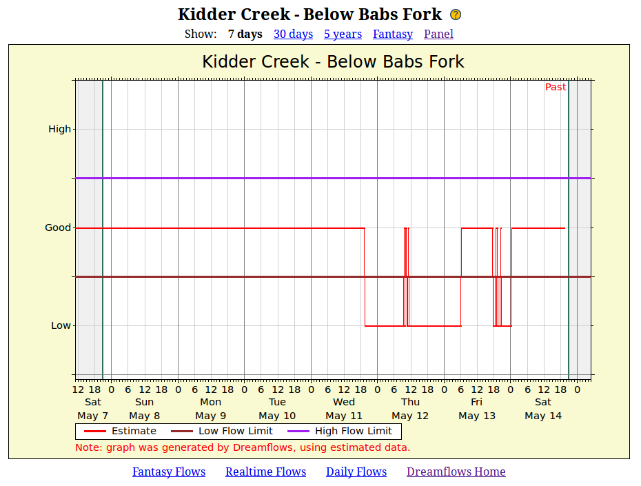
In this case, the purple and brown horizontal lines split the vertical axis into three sections, and
Dreamflows plots each data point next to the Low, Good or High label,
depending on whether it thinks the flow is Low, Good or High.
Of course this is all very subjective and open to error,
however it should still give you a reasonable idea of whether it's worth heading to the river or not.
Some runs end at reservoirs.
Depending on the current reservoir level, there could be a significant paddle out across the reservoir to take-out.
Where appropriate, Dreamflows reports the approximate paddle out distance (in miles).
Where reasonable, Dreamflows embeds agency-generated flow graphs on the Day graph page
instead of drawing the graph itself.
The following embeds a USGS graph:
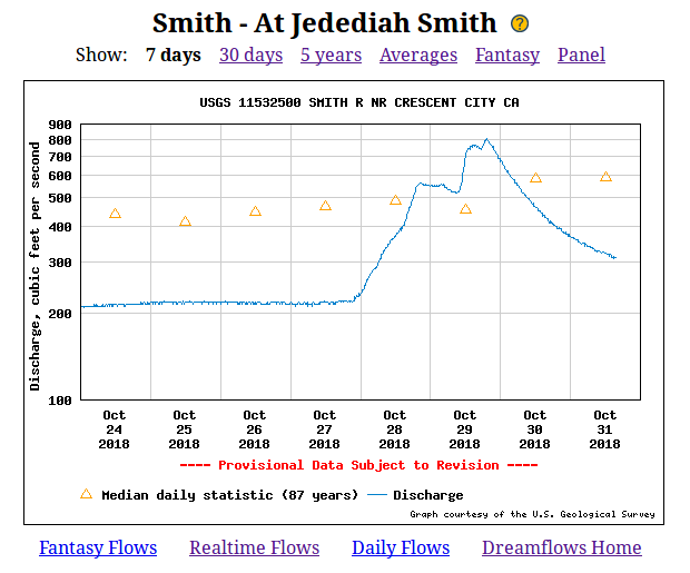
Note that Dreamflows provides a wrapper (with a title and links) around the agency graph,
however the graph itself is drawn by the agency, not by Dreamflows.
This graph type is essentially the same as the Day graph,
the only real difference being the time scale.
This graph type is similar to the Day and Month graphs,
except:
Note that the red plot ends late October, 2018 since the above snapshot was taken then.
The red plot will extend further to the right as time goes by, though the other plots (blue, green, etc) will remain unchanged for the rest of the year.
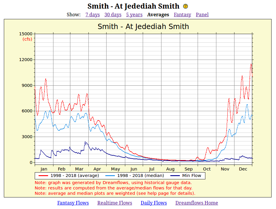
The red plot is a weighted average, which in this context means that for each day of the year being calculated,
the displayed value is the arithmetic mean for that day,
mixed in with arithmetic mean values from adjacent days to smooth the results somewhat.
If the Note: at the bottom of the image ends with using scheduled-release info:
then flow in the river is expected to be at least the scheduled flow.
On rare occasion (for mechanical, electrical, safety or other reasons), releases are lower than scheduled, or there is no release.
More usually, though, actual flows are higher than scheduled.
If the Note: at the bottom of the image ends with using NOAA/NWS data:
then the flow predictions may indeed be largely fantasy.
If the Note: at the bottom of the image ends with using a fantasy prediction model:
then Dreamflows is applying its usual statistical estimating model for that flow site, but to NOAA/NWS flow prediction data.
This compounds the error.